Three decades before TikTok’s obsession with tinned fish brought us sea-cuterie boards, tinned fish cookbooks, and trendy brands like Fishwife and Scout, there was Bela Brand Seafood. This OG tinned fish purveyor hit grocery store shelves back in 1997 with aesthetic, design-centric packaging—and now, it’s refreshing its brand identity to remind modern audiences that it took a bet on tinned fish before it was cool.
Bela (formerly known as Bela Brand Seafood) was founded by native New Englander Joshua Scherz and his mom, Florence. The brand has remained family-owned since its inception, quietly growing without any funding from outside investors. But during the pandemic, Scherz says, canned food of all kinds experienced a kind of “renaissance.” Tinned fish—including Bela’s inventory of sardines, mackerel, and codfish—began flying off of shelves and onto screens via a deluge of influencer reviews and recipes, earning it the official title of “hot girl food.”
But along with that consumer demand, Scherz notes, has come a wave of tinned fish products with a higher price point, designed with trendiness and exclusivity in mind. Meanwhile, the core of Bela’s business model remains centered around sustainability and accessibility (the latter is a key feature, Scherz says, for a product originally designed as a utilitarian pantry staple). The brand’s bold new look and digital presence brings it into the 21st century while emphasizing Bela’s roots as a ‘90s brand for the everyman.
Bela makes a splash
Back in the late ‘90s, Scherz says, tinned fish was a dying industry. For Scherz, though, it had always been a constant. Growing up in the Boston area in an Eastern European family, sardines were a staple for his family; and, when he served in the U.S. Air Force for four years, they became even more of a mainstay at mealtime.
Once Scherz returned from his time in the military, he and Florence saw an opportunity to turn their love of sardines into a family business. But, as they began to search for a cannery partner in New England, they realized that the number of options had dwindled sharply over the years. So, they decided to partner with a cannery in the coastal town of Olhão, Portugal that aligned with their goals.
“Back then, sustainability meant supporting a local economy that was disappearing,” Scherz says. “We wanted to save a lifestyle, a way of life, a business, a product that was that fast declining. The canneries in Maine had gone away; the canneries in California had gone away; there were no canneries left in the United States. When we went to Portugal, sustainability meant creating a product and keeping it going.”
The OG aesthetic tinned fish
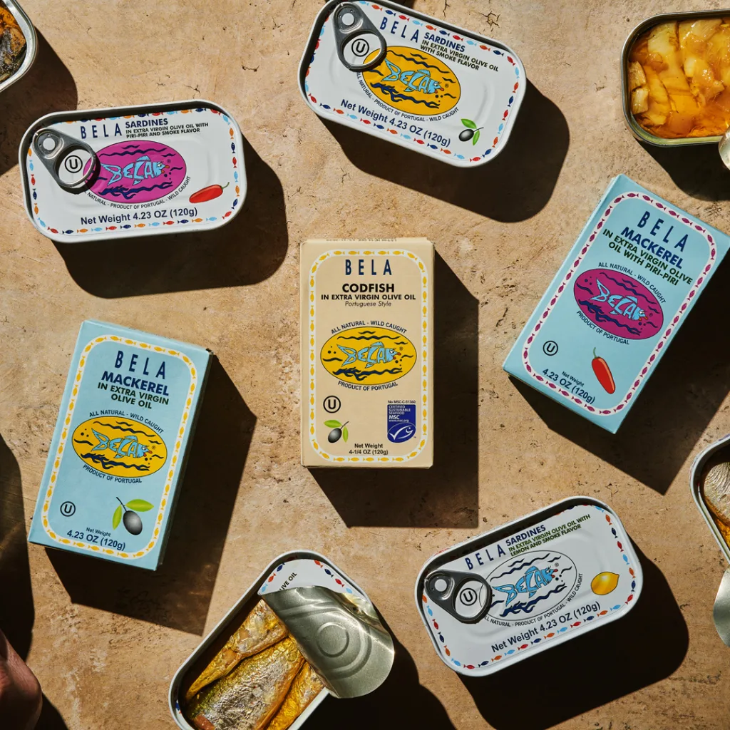
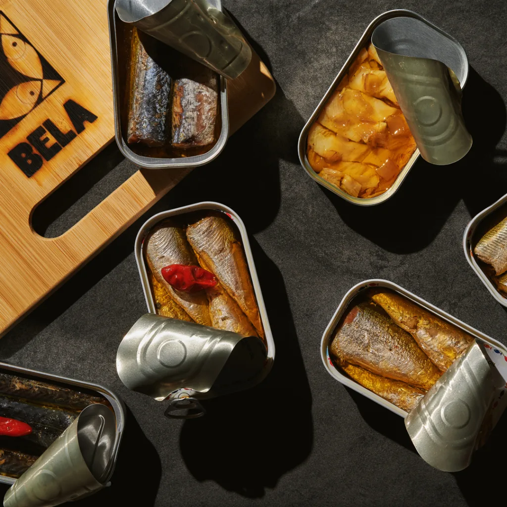
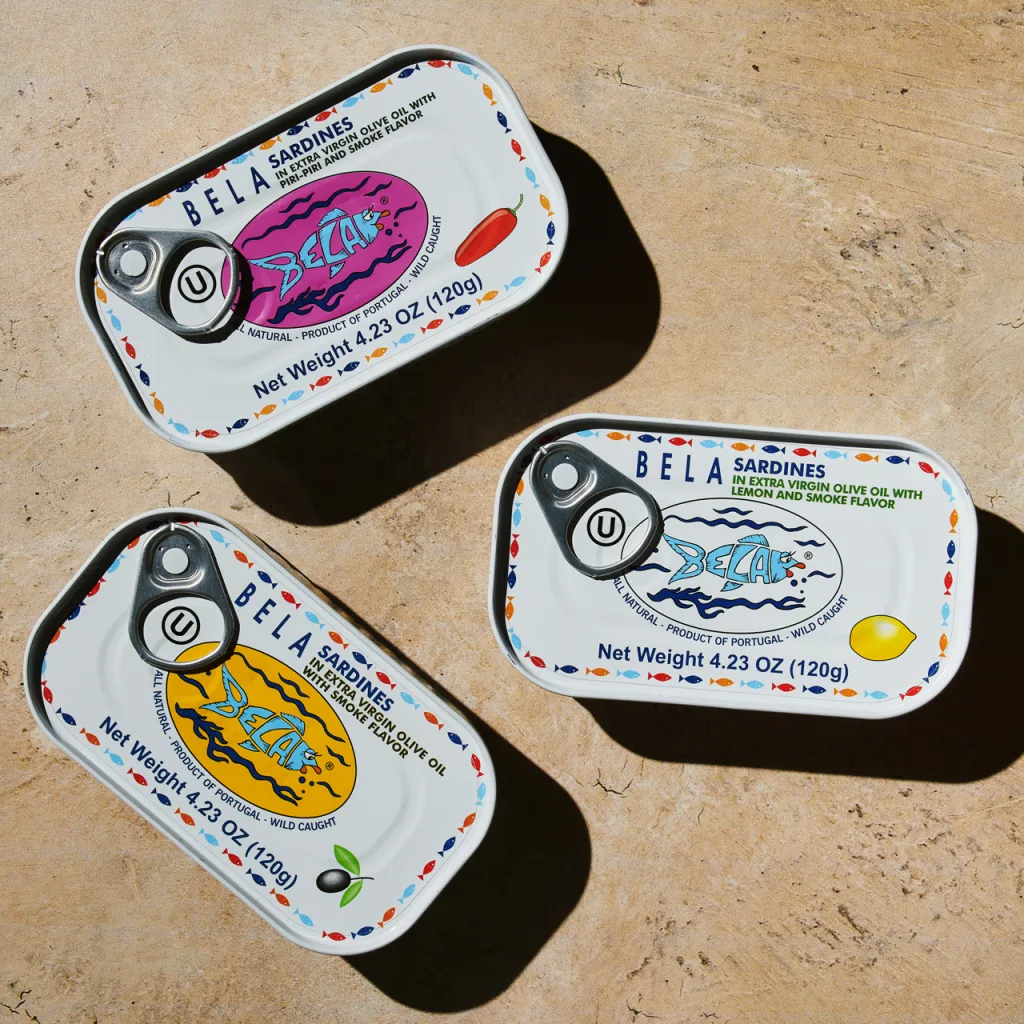
From the start, Bela set itself apart by packing its fish in extra virgin olive oil rather than hydrogenated soybean oil. And the company literally stood out on grocery store shelves for its playful, ultra-detailed packaging, featuring a lipstick-wearing fish mascot (or “spokesfish,” as Scherz nicknamed her) and a simple, sans-serif font.
“One of the things about our design back in 1997 was that we were one of the first lithograph, six-color process cans,” Scherz says. “Everything else was a wrap, or a box, or it was dirty and dingy on a shelf with a plastic wrap. We got shelf placement instantaneously 30 years ago, because we were always a very design-focused brand.”
The choice to put package design front-and-center has proven to be a prescient move for Bela, as tinned fish has suddenly found itself in an unlikely spotlight.
“I call us pandemic gold,” Scherz says. “Unfortunately, the pandemic was what made sardines so popular. I mean, I’ve been selling sardines for 23 years before the pandemic, and we were always in stores trying to gain trial—but the pandemic was a forced trial. People were concerned about cooking food or getting groceries and wiping them down. We forget how paranoid we were five years ago, but this product was clean, it was safe.”
According to Scherz, Bela’s growth plan of 8-10% per year has consistently doubled in the years following the pandemic. And per a report from IndustryARC, the global canned fish market is expected to reach $11.3 billion by 2027. The surge of interest in the product has caused new companies like Fishwife and Scout to emerge with their own carefully curated packaging and flavors (both companies sell their wares for around $35 per three-pack or more, depending on the variety). Meanwhile, new high-end brands are charging as much as $75 for a three-pack of smoked eel or $26 for a single can of tuna.
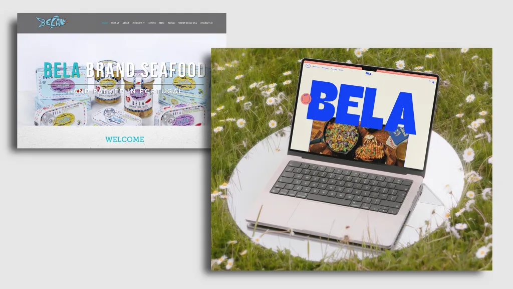
But Bela wants to assert that you can have your aesthetic fish and eat it, too—for prices ranging between just $5 and $7 per tin. With its new branding, Bela is emphasizing its accessibility and family-owned business model with slogans like “Fish is family” (amazing) and “Everyone’s welcome to the table.” And, the company is inviting a younger generation to enjoy its products with a modernized website that allows customers to purchase its products directly for the first time.
New design, same ’90s vibe
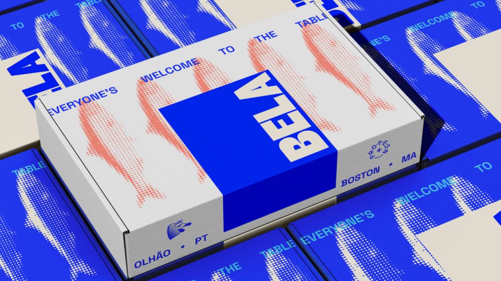
On shelves, Bela is sticking to its iconic ‘90s packaging—a smart choice, given the current resurgence of ‘90s-inspired CPG branding and the emphasis on visually exciting tinned fish designs (see Fishwife’s popular packaging, for example). But the brand’s digital presence is getting a major overhaul, spearheaded by the design agency Vicious Studio, with a new logo, website, and merch that even Gen Z can get behind.
The Bela wordmark is now rendered in an ultra-bright-blue custom font. It’s an all-caps sans-serif, in keeping with the brand’s packaging, but now in a much bolder and bubblier form to bring the brand’s look up to 2025’s speed.
“Bela’s new look is bold, bright, and impossible to ignore—just like the New England I grew up in during the ‘90s,” says Vicious Studio designer Nicholas Jackson. “The wordmark has Fat letterforms with ink traps—a nod to old-school industry but with a fun, modern edge. It’s punchy, super legible, and stands up on a shelf like it owns the place.”
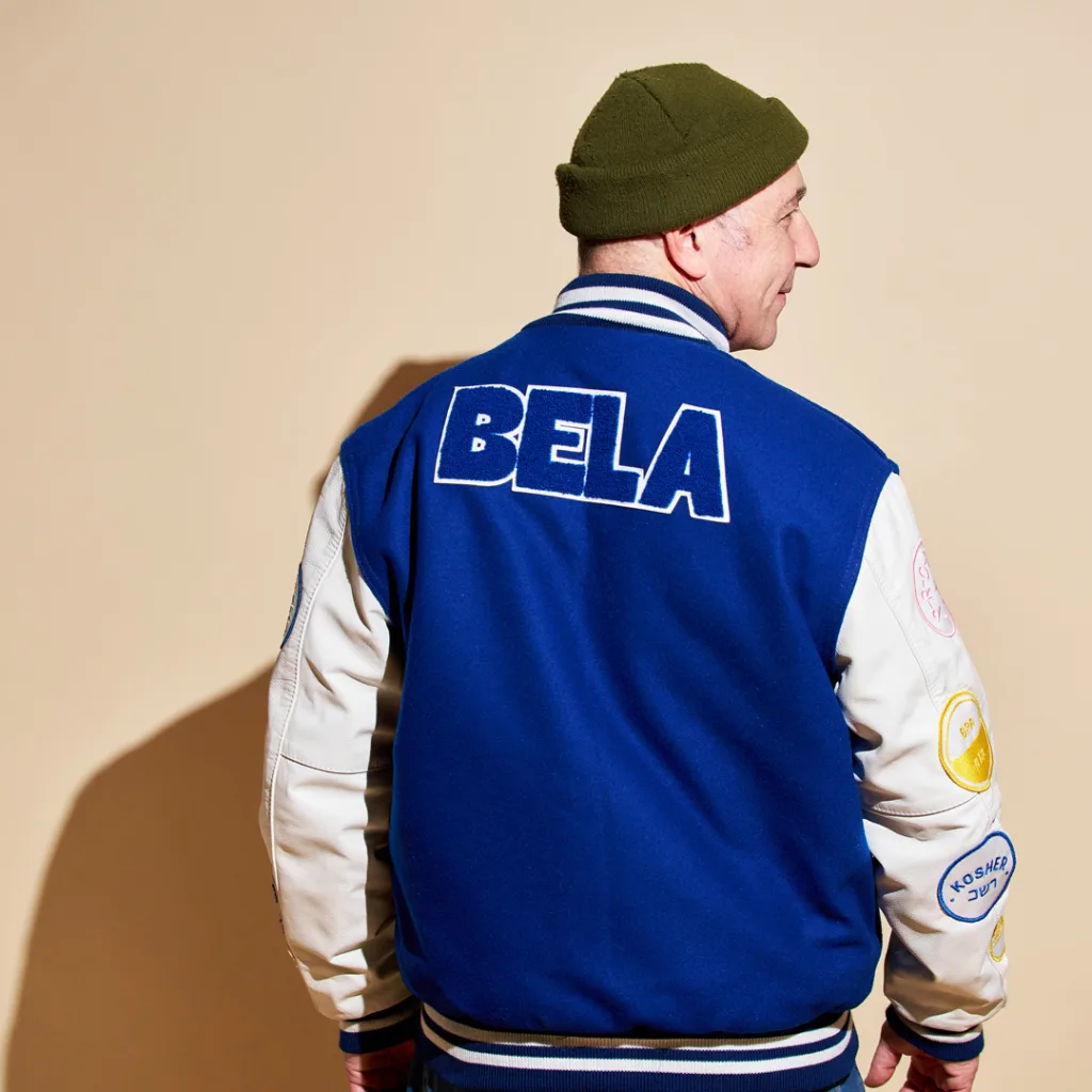
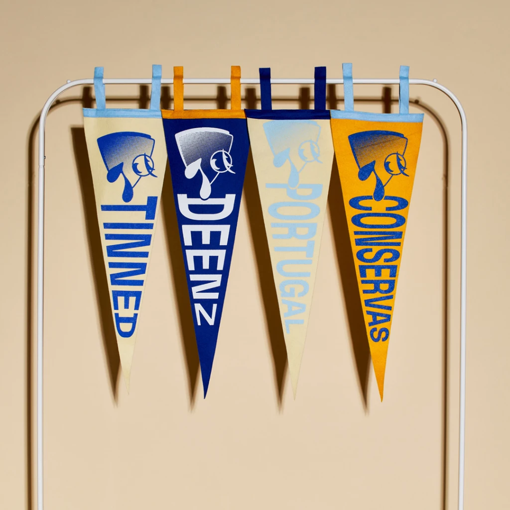
The “spokesfish” mascot, Bela, has also gotten a makeover. Now, instead of being a full fish, she’s a sort of “talking head,” a more versatile design that can be oriented vertically or horizontally. Her signature eyelashes and lips remain.
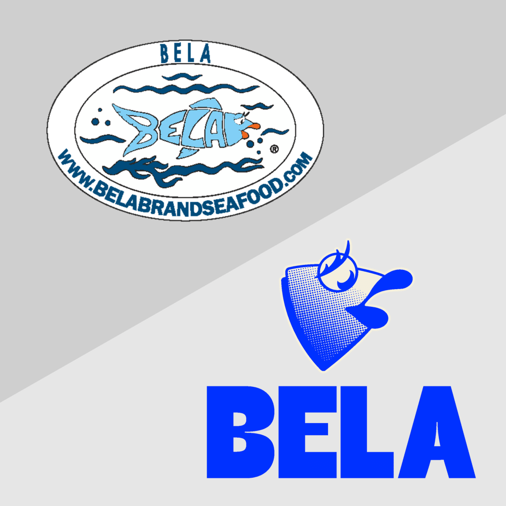
“The fish, still Bela at heart, got a digital-first glow-up,” says Jackson. “We tightened her up, focused on her head, eyes, and lips, and made her sharper, more scannable, and built for now. She’s no longer hand-drawn, but she’s still got that same energy, now with knocked-out outlines and a halftone texture—a little throwback to vintage print and the grittier, hard-worn aesthetic of New England docks and fish markets.”
Bela is also test-driving a lifestyle move à la Sweetgreen and Erewhon with its own merch. The launch includes a trendy canvas tote bag, graphic crewnecks, and some retro-inspired banners (somehow, Bela is not the first fish-forward company to invest in trendy merch in the past several months—see Gorton’s fish stick tote bag designed for Gen Z).
In the coming months, Scherz says, customers can expect an even larger branding overhaul from Bela. For now, though, he’s focused on ushering in a new era that he calls “tinned fish 3.0.”
“If you look at Bela 1997 as tinned fish 1.0, then tinned fish 2.0 would be around the pandemic time, when it started to morph a little bit,” Scherz says. “Going forward, we’re going to start tinned fish 3.0—rebranding with fish-forward flavors and getting back to the utilitarian roots and authenticity of tinned fish. This 3.0 version is not going to be about glamour; it’s going to be about the fact that it’s a protein, it has omega-3, and it’s a delicious fish.”