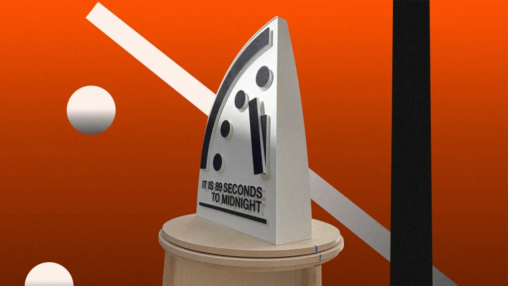
The Doomsday Clock is perhaps the most sobering graphic symbol ever created: a quarter of a clock with four big dots to mark the countdown to midnight, an euphemism for the end of world You might think that the significance of a clock that counts down the moments until humanity’s annihilation can’t be understated, yet its physical form has always been lightweight compared to its intent.
For 78 years, the Bulletin of the Atomic Scientists have presented a new tic-tock of doom in a press conference, informing the public of the latest doom countdown based on the events of the past year. Each year, they accompanied the news with a physical representation of the clock that is not much of a clock at all. Rather, it’s a flimsy panel with paper hands and dots stuck to it. The occasion needed a much stronger visual, one that would attract the attention of photo editors everywhere. That happened last week, when a new clock appeared one tic closer to apocalypse: It is 89 seconds to midnight.

“The physical clock that they were using was basically like a whiteboard,” says Juan Noguera, Assistant Professor of Industrial Design at the Rochester Institute of Technology. “They would unveil it by pulling this black cloth and it was just a wobbly setup, with stuff almost falling off it.”
Together with Tom Weiss, Associate Department Head at the Rhode Island School of Design and founder of Altimeter Design Group, Noguera redesigned the physical clock in 2024. It came at the request of Rachel Bronson, then the President and CEO of the Bulletin of the Atomic Scientists. Bronson wanted something more iconic; something that would capture the gravity of the clock’s message. The physical clock had to be as powerful as the symbol it represents; it need to command the attention of photographers and journalists who could echo the message of this timepiece of doom.

Tic-toc to apocalypse
American artist Martyl Suzanne Langsdorf conceived of the very first Doomsday Clock back in 1947. It followed the aesthetic of public clocks of that era. It featured a minimalistic large face with smaller dots and a white minute hand that was much thinner than the black hour hand, which was anchored at 12. That design served as a stark reminder of nuclear danger for nearly 80 years, becoming a universally recognized symbol of existential threat. The clock’s hand has moved closer to and further from midnight over the years, reflecting the changing global landscape of nuclear risk and climate change. As things got really grim during the worst years of the Cold War, the clock design went from showing only the second half hour of a face to showing just the quarter, Noguera says. It never went back past the 45 minute mark again.

In 2017, design studio Pentagram updated the Doomsday Clock’s graphic symbol, modernizing its look while maintaining its iconic essence. “I believe [Pentagram] hastily produced a physical version of it that had been used by the bulletin in events since then,” Noguera says. The Pentagram symbol was strong then and now, however, and it served as the foundation for Noguera and Weiss’s design of the physical clock from the very beginning of the process.
Noguera and Weiss started with traditional sketches, which were then brought to life using a generative AI tool called Vizcom that lets designers add color, texture, and lighting to their sketches. The front of the physical clock is a flat surface that features the graphic symbol designed by Pentagram.
Under it, Noguera and Weis introduced two lines of text that spell out the time in English. According to Noguera, this element turned out to be a big success, as most of the photographers focused on it during the presentation. The typography on the clock face uses the Bulletin’s specific Helvetica subvariant, ensuring consistency with their brand identity. On the back of the clock there’s the logo of the Bulletin of the Atomic Scientists set over a gently curved surface that gets thinner towards the top.
Their design also included a pedestal. At the beginning they played with the idea of making the entire thing a large monolith but ultimately decided to separate the two pieces. Leaving the face as its own object meant Bulletin could more easily bring the two parts around the world to different events. It also allowed for a unique aesthetic. “We wanted that dichotomy of the handmade traditional and the 3D printed object,” Noguera says. “A deliberate juxtaposition of modern technology and traditional craftsmanship.”

A star is born
Once they locked this design, they created CAD models for manufacturing. The clock was 3D printed in a single piece that’s 33 inches tall. Embedded within the clock face are close to 100 magnets that hold the hands and the interchangeable numbers and text, which allows the date and text to be easily updated.
This clock rests on a handcrafted wooden pedestal. “The pedestal for the clock itself is completely handmade, intentionally, very traditionally,” Noguera says. The legs of the pedestal were hand-turned, and the walls were steam-bent. The entire piece is an imposing 6.5 feet tall.
The new Doomsday Clock made its debut at the Bulletin’s 2025 press conference on January 28, where it was the star. Its striking design and prominent display ensured that the clock’s message was front and center in media coverage, Noguera told me with satisfaction: “Instead of seeing some people talking on the photos like every other year before, now you see the clock featured in every single shot.”


