Science just vindicated your font choices.
Researchers from Hanyang University in Seoul, South Korea, quantified the most common font pairings by analyzing and mapping which fonts are used together across advertising, album covers, books, packaging, and websites. Their findings, based on combinations of 8,042 two-font pairs and 3,089 triplets found on Fontsinuse.com, published in Scientific Reports, and available on nature.com, provides a novel and visual way of thinking about which fonts go together and why.
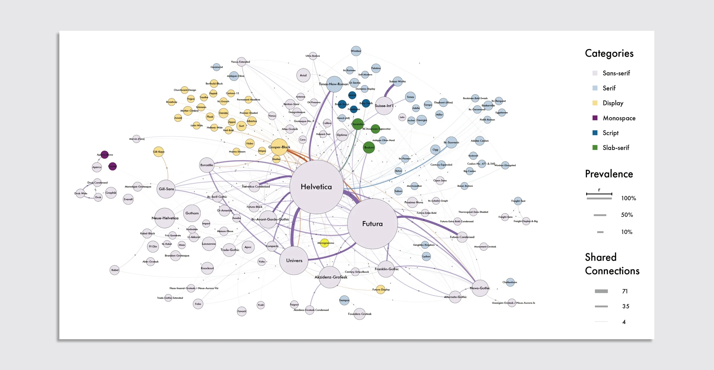
The study validates what graphic designers already know—we live in a sans-serif-first world—but a network graph published in the study shows the extent of it. Helvetica, Futura, and Univers are the workhorses of the design world, forming the largest nodes of the researchers’ data set, followed by other sans serifs like Akzidenz-Grotesk and Gotham. These clean, modern fonts showed up more than any others and were paired with a wide variety of secondary and tertiary fonts, depending on the medium.

“These fonts are highly versatile, serving as the foundation for typographic designs across a wide variety of contexts,” authors Jiin Choi and Kyung Hoon Hyun wrote about sans serifs. “Their strong connections to other fonts, particularly the frequent pairings between Helvetica and Futura, demonstrate a robust complementary relationship, making them staple choices in contemporary design practices.”
Meanwhile serif, decorative, and script fonts tend to form smaller, secondary clusters, showing their specialized roles for different use cases. Magazines and periodicals typically used serif fonts suitable for reading in print, while advertising tended towards pairings that included more visually ornate fonts. Mobile and tablets biased thicker fonts, which are better for reading on a device. Branding and identities used pairings with more fonts that have bold, distinct glyphs.
The study found that some mediums have font pairings with minimal differences, like booklets and pamphlets, branding and identities, and magazines and periodicals. Album art was just the opposite, with much more disparate pairings of basic and decorative fonts, suggesting it might be common for designers to pair a fun font for the artist or album name with a more easy-to-read font for the rest of the album art.
The top overalls pairings are Futura-Futura Condensed, Futura-Helvetica, and Helvetica-Times New Roman, according to the study, but as researchers found, it all depends on the medium. A clean, versatile font is great for the base, but depending on the use case, designers can pick the most appropriate pairings.
“Given the highly visual and intuitive nature of typography, designers seek practical guidelines that not only enhance visual aesthetics but also align with the emotional tone of the content,” they wrote, and therefore, “understanding the fundamental visual characteristics of fonts is critical for practical design application.”
The authors of the font pairing study see their research as a “first step in understanding font morphology and pairing relationships” to be expanded on in subsequent studies.


